I’m feeling a lot better today, less exhausted ouchies and more “It’s cool, I’m good.” No naps today, no wishing I had a sling for my mostly incapacitated arm, just chilling and learning things.
Like using words to generate color palettes. Let’s see what we can do with that, shall we?
Using the Unsplash photo database, this site retrieves images related to your search term, combines them into a single image, then extracts a color palette. One nice thing is that you can deselect some of the component images, darken or brighten the palette, or zoom in to highlight just some of the colors in an image. I do find that the results tend to be a little muddy (“summer” is a lot duller grey and brown than I expected) but the tweaking helps.
* * *
Then what? I decided to learn how to color grade an image. Essentially, grading is a technique that lets you take the palette from one visual and apply it to another, often changing the tone and emotion of the image. A photo can go from warm summer afternoon to dark and stormy without a lot of fuss.
There are a lot of ways to do this but here’s a handy tutorial explaining the process in Affinity:
Steal the Color Grading from Any Image with Affinity Photo!
PhotoChrome has a link to download the composite image but it didn’t work for me. Instead, I used the “copy HEX” option for the color palette, then copied the darkest, lightest and middle colors into the Affinity photo Gradient Map / RGB Hex Sliders window.
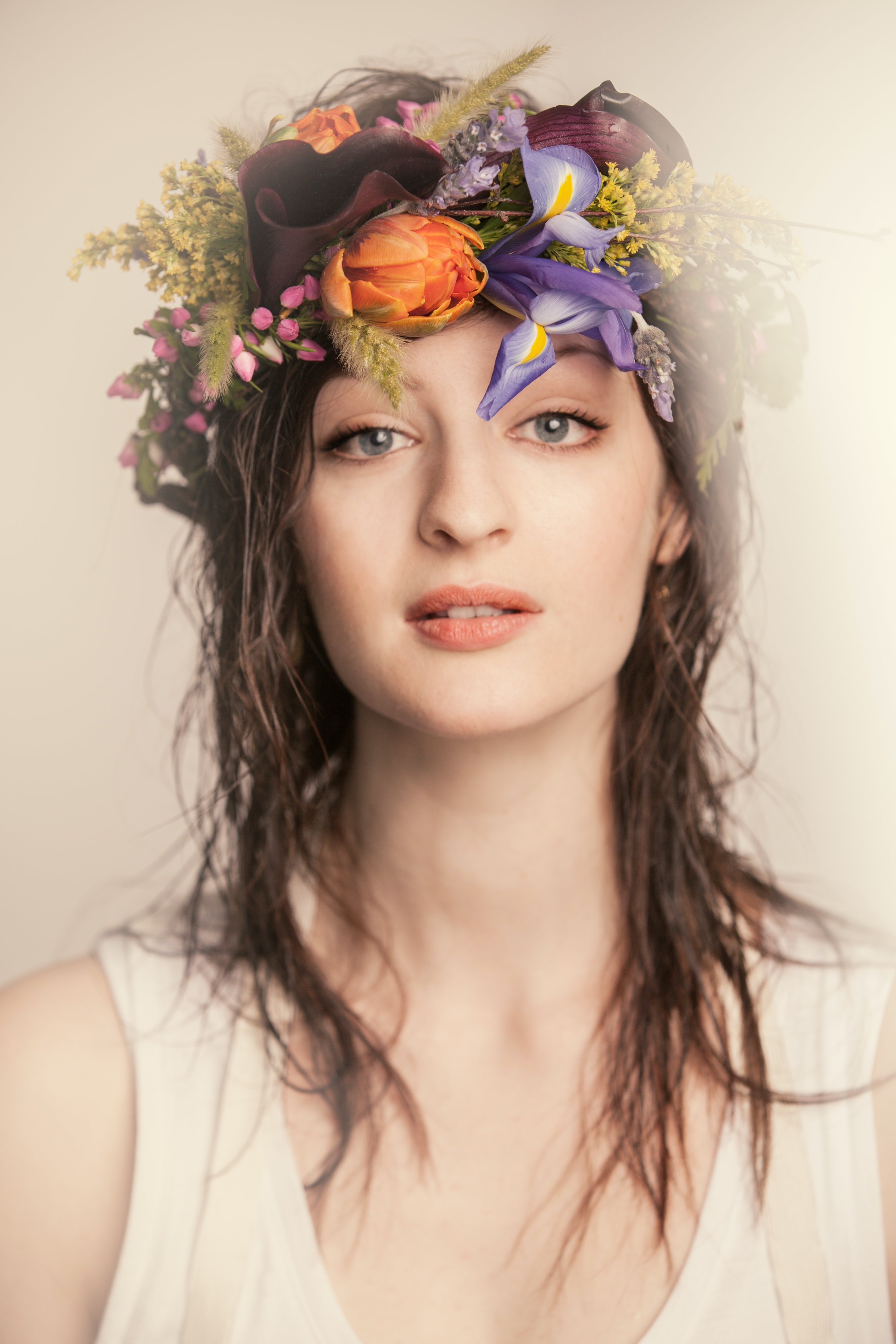
What’s the color of cool? In my version of this exercise, this:
#4b5c74, #656778, #767482, #718694, #80949d
Here’s what that looks like when transferred onto an image.

Then I had to try a couple of others for fun.


It’s probably no surprise that I’m liking Mars best.

Leave a Reply!