Feeds:
Posts
Comments

Posts Tagged ‘maps’

The leaves here are beginning to turn but the full glory of fall has yet to arrive. When will it come to your area? If you’re in the US (or can extrapolate to Canada), this map can help narrow it down.

2025 Fall Foliage Map & Peak Leaf Color Guide | The Old Farmer’s Almanac

Wondering when and where to see the best fall colors in 2025? Our Fall Foliage Map tracks peak leaf season across the U.S….

See when fall foliage could peak in your area – NPR

Trees shed their leaves in order to store and recycle valuable nutrients (in their trunks and branches) before winter’s ice and snow can rip them off. As temperatures drop, chlorophyll — the pigment that makes leaves appear green — starts breaking down, revealing the yellows and oranges they’ve had all along.

Like many of us, leaves hide their layers. I try not to forget it, and that all of this beauty and color has been right there, all along. 

* * *

Read Full Post »

Have you ever wanted to see history ebb and flow like a river of time? Me too!

This 5-Foot-Long Chart Lays Out Over 4,000 Years of World History

In 1931, John B. Sparks created the Histomap, condensing more than 4,000 years of world history into a vibrant infographic…

“Clear, vivid, and shorn of elaboration, [the] Histomap holds you enthralled as you follow the curves of power down time’s endless course,” the map’s front cover reads. “Here is the actual picture of the march of civilization, from the mud huts of the ancients through the monarchistic glamor of the middle ages to the living panorama of life in present day America.”

(Conflating “monarchist glamor” and the Middle Ages is a bit much, but such information provides yet another view of history, and how it changes.)

Time waits for no one but this map stops at the beginning of the 20th century. Even so, it’s a fascinating visualization of the rise and fall of civilizations, both common and lesser known.

The link above will take you to the article and smaller image of the map. For a more detailed, digital version of the Histomap, head over to Yale University Library and enjoy!

* * *

Read Full Post »

Global trade is very much in the news these days. While many of the current moves from the US seem designed to take the country back to a time when every country stood on its own, those times have, arguably, been much exaggerated. There are many historical examples of interconnectivity, from the Egyptians to the Greeks to the Romans to the Silk Road and many more, but I recently saw a very cool map that brought this idea home.

A Brilliantly Detailed Map Of Medieval Trade Routes & Networks

Even before the modern era, the Afro-Eurasian world was deeply interconnected through trade.

I found this map to be a fascinating look into a network of world trade during an era many might assume was very insular. The only thing I wish it included is travel times. How long, for example, would it have taken for cardamom to get from India to Venice to Oslo and into a loaf of braided bread?

Here’s the map from Martin Jan Månsson, part of his website, The Age of Trade

Medieval trade route networks

Zoom in and be impressed! 

(Bonus for your amusement: a comic on tariffs from xkcd 🙂

* * *

Read Full Post »

I like maps. If you do too, and you are the sort of person who creates worlds that need maps (looking at you, authors!), this might be the tool for you. 

Inkarnate – Create Fantasy Maps Online

Turn your ideas into incredible fantasy maps with Inkarnate’s easy-to-use online map-making platform.

Ideal for Game Masters, Fantasy Authors and Map Enthusiasts.

No affiliation, it’s just a site I found when looking for a good mapmaking tool for casual cartographers. The free plan includes several hundred art assets and as many as ten maps for personal use. Need more because your imagination just can’t be stopped? For $25 a year you get thousands of assets, high-resolution exports, a commercial license, and can make up to 2,000 maps. Which seems like a lot, even to me.

* * *

Photo by Gu00fcl Iu015fu0131k on Pexels.com

Read Full Post »

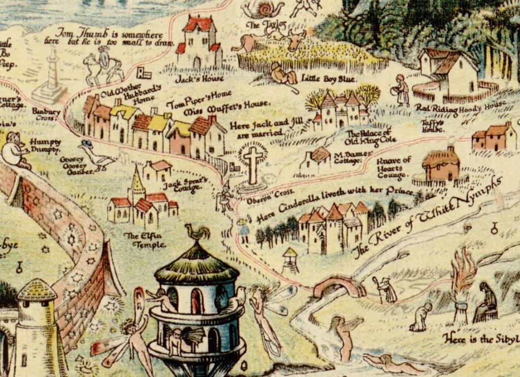
Yes, the internet can sometimes be a bit of a drag, but then you stumble across the one thing your six-year-old heart most desired: A map of Fairyland.

An anciente mappe of Fairyland – newly discovered and set forth

Excerpt from Sleigh, Bernard, and Sidgwick & Jackson. An anciente mappe of Fairyland: newly discovered and set forth: imaginary locality. [London: Sidgwick & Jackson, ?, 1920] Map. https://www.loc.gov/item/2006628749/.

Found when perusing Texas A&M Libraries’ Maps of Imaginary Places.

* * *

Photo by Daniel Kempe on Unsplash

Read Full Post »

I’m knee-deep in appliance shopping (yes, 1, 2, 3, 4 again), but I ran across a fun dialect survey and thought you, gentle readers, might find it amusing. There are fireflies (or are they lightning bugs?). There are drive-through liquor stores (or not). There are maps!

Word choice is also a useful dimension to consider when developing a character.

Here’s the source that tipped me off:

The Decade-Old Dialect Quiz You Should Take – Now I Know

And here’s a link to the survey:

And here’s a more in-depth look at firefly vs. lightning bug:

Why Some Americans Say ‘Firefly’ and Others Say ‘Lightning Bug’

* * *

Photo by Rajesh Rajput on Unsplash

Read Full Post »

More Mars

You can now explore the highest-res map of Mars ever made

also 

NASA released wild footage of Mars helicopter flying over alien desert | Mashable

* * *

Photo by SIMON LEE on Unsplash

Read Full Post »

Maps Distort How We See the World – by Tomas Pueyo

Maps twist our perception of the world.

* * *

Photo by USGS on Unsplash

Read Full Post »

Oh, this is fun. If you have a little map, environment and/or geography geek streak, check out this interactive:

River Runner by Sam Learner

* * *

“Do unto those downstream as you would have those upstream do unto you.”

― Wendell Berry

When a raindrop falls, where does it go? If it falls on my hometown, it flows 390km to the Atlantic Ocean.

If it falls on the Denver Broncos’ Mile High 50-yard line, just east of the Continental Divide, the path to the Gulf of Mexico is 3862km!

Click a starting point and the site will calculate a route and then do a visual fly-over. I wish it covered places outside the US but it’s still a fun and impressive window into data from the always excellent USGS.*

* Ah, the USGS, font of so much maptitude! Wait, is that a volcano webcam? Stop browsing, woman, you have work to do! But remind me to tell you my volcano story someday:)

* * *

river running through a forested glade
Photo by Dave Hoefler on Unsplash

Read Full Post »

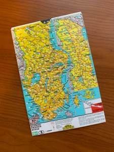
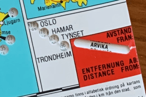
Thinking about my grandfather yesterday got me thinking about our trip to Sweden. Here’s one of the best souvenirs I brought back, an adjustable driving distance calculator. The sheet inside slides to show distances from a given starting location. I like maps, and this one is particularly well done.

* * *

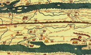
For fun, here’s one of the first known distance maps, the Tabula Peutingeriana, with measures for (where else?) the center of all things at that time, the Roman Empire. Although at 22 feet long, it’s not exactly portable!

Tabula Peutingeriana map
Conradi Millieri derivative work: Thecinic, CC BY-SA 3.0, via Wikimedia Commons

Read Full Post »

Older Posts »